Health tracking made simple: for the busy, the lazy, and everyone in between.
ROLE — UX Researcher & Designer
DURATION — January to May 2025
TOOLS — Figma
KENKO
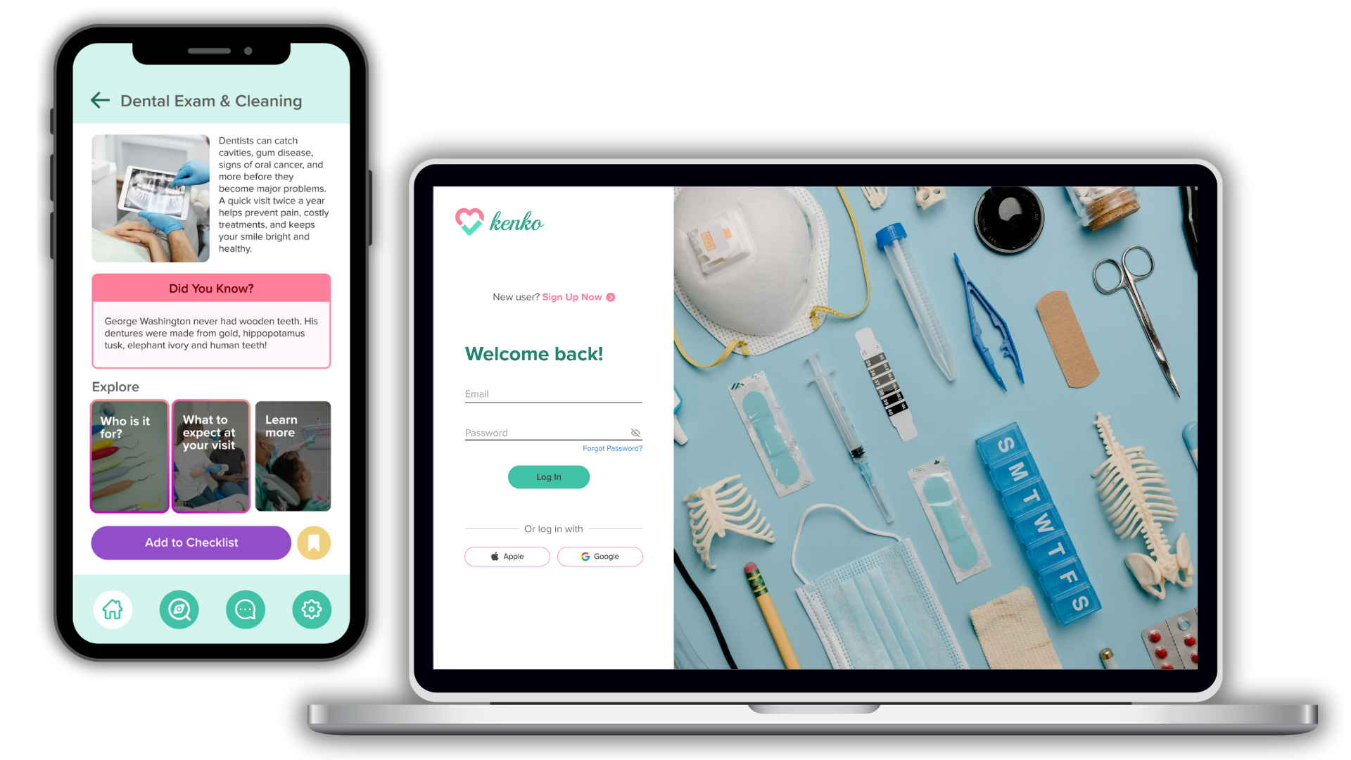
TABLE OF CONTENTS
❀
The Big Picture
This was my first full-fledged UX challenge, and it came with a complex problem: in our fast-paced world, people are struggling to stay on top of their physical and mental health needs.
⚡️ The Challenge: How can we help patients stay on top of their health, without all the mental effort?
It sounded straightforward. Except…where do I even begin with a brief that broad?
What do people actually want that isn’t already out there?
Unpacking the Problem
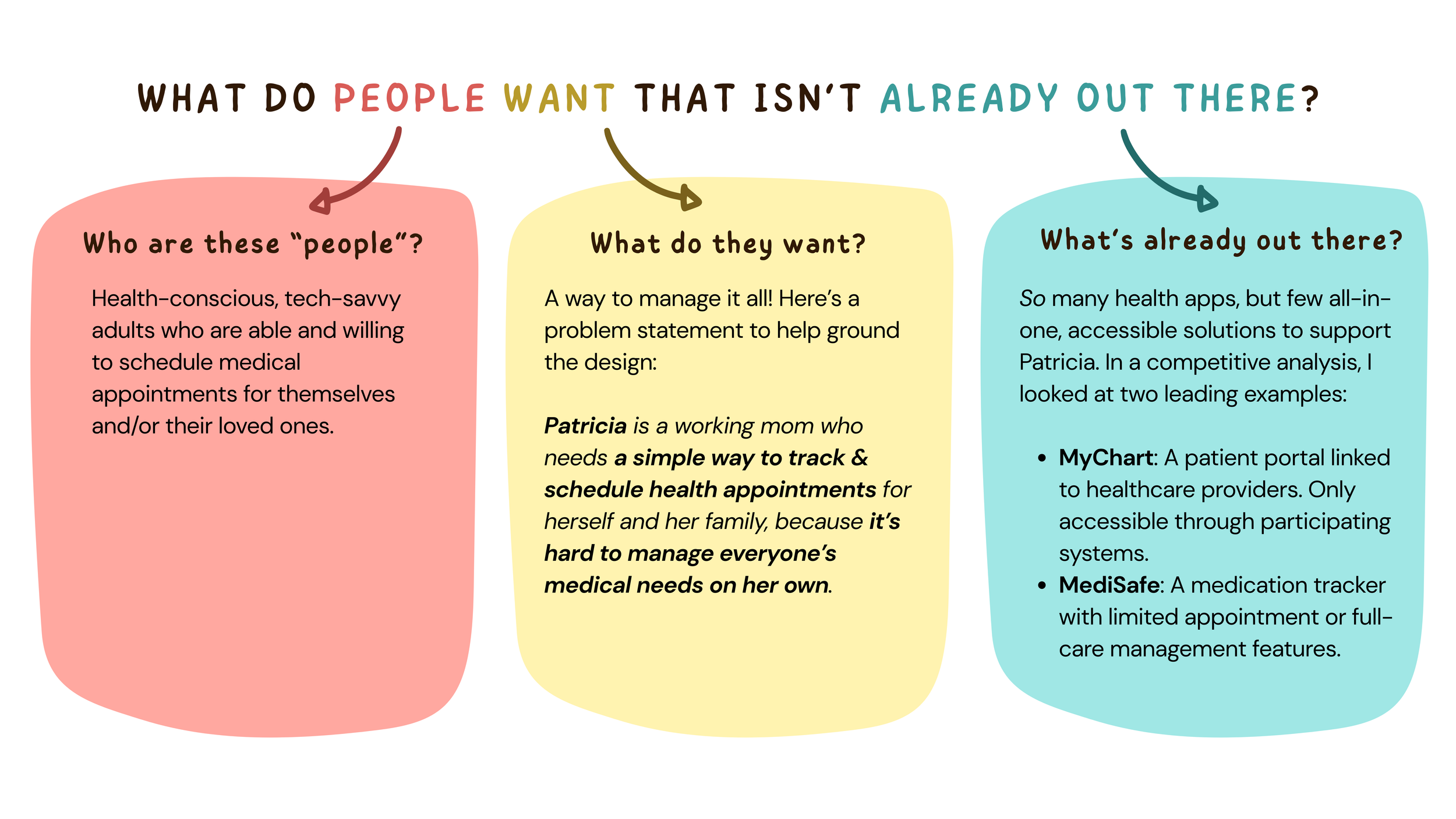
To start, I broke that question down:
From here, I saw an opportunity to build a comprehensive, provider-free app that puts the patient first. It was going to be something educational, intuitive, and designed to take the mental load off.
To explore some functions and features that this app should have, I created some User Stories.

Meeting Our Users
At this point, I had a clearer picture of the project. But I wanted to make something that real people would want to use, so I turned to real people for answers.
I conducted user interviews (N = 4, age range = 25-35) to learn more about our potential users’ habits, challenges, and goals around health management. I asked about
the health apps they use,
how they manage their care,
what they know (or don’t) about their health needs,
and what features they wish existed in a health-management app.
From the research data, two key personas emerged.
👩⚕️ Ellie (27) — The responsible older sister managing care for her brother with a heart condition — while trying to balance her own life. She needs an app to help her stay organized and in control.
🧢 Mark (31) — Just a Chill Guy, finally starting his health journey. No PCP, low health literacy — he needs an app that educates him, nudges him, and handles the mental load of keeping track of it all.
Together, Ellie and Mark’s stories shape the core of the product. Their combined struggles, needs, and hopes became my design compass.
Bringing Ideas to Life
That brought me to my favorite phase: wireframing & prototyping!
I began by visualizing how users would interact with the app’s three core features:
Scheduling an appointment
A personalized health appointment checklist
A curated resource library
Using Figma, I then brought these wireframes to life as prototypes, incorporating two additional flows:
An onboarding tutorial, and
A quiz that generates a checklist of recommended medical appointments and screenings based on the user’s age, medical conditions, and other personal factors. (This takes the guesswork off users like Mark when it comes to health checkups!)
Scheduling an appointment
A personalized health checklist
A curated resource library
Onboarding tutorial
Checklist set-up quiz
Seeing It in Action
I felt pretty good about my design so far and was ready to turn it over to our potential users.
How would they understand or receive Kenko? Was it something they would actually use?
To find out, I ran moderated remote usability tests with six target users I trusted to be brutally honest. All participants were asked to complete the following tasks:
Complete the onboarding tutorial and set up a checklist
Schedule an appointment
Add an appointment to their checklist
(A) Save and (B) locate a video in the resource library
Here’s what I learned:
✅
All six participants successfully completed every task – with just one participant needing a minor hint on Task 4B.
⭐
The checklist was a fan-favorite feature: it was the top reason users said they’d download Kenko. That made it clear: I needed to fine-tune it to be as intuitive, organized, and accessible as possible.
📍
The dashboard needs to be further optimized to include key actions and information, since it’s the main entry point for users.
Tweaks, Edits, & The Final Design
The usability test taught me how valuable (and satisfying!) iterative design can be. I embraced the opportunity to refine my work, making a series of small but crucial changes inspired by user feedback, accessibility best practices, and thoughtful peer critiques.
Accessibility Check
Icon Redesign
Feedback Implementation
Each perspective helped me uncover usability issues and spot inconsistencies in my design, ultimately making the final product more user-friendly and cohesive.
The screenshots below represent key moments across each mobile flow, reflecting the final design choices I made based on user testing and feedback.
Login & onboarding
Checklist set-up
Scheduling an appointment
Adding to the appointment checklist
Saving & locating a video in the resource library
Looking Back & Moving Forward
I wish I could bring this project to fruition—partly because it was so much fun to work on, and partly because I want a checklist too (and others have said the same!). But even as a concept, working on this project has been a deeply rewarding experience.
I’m grateful for the iterative design process—and for the reminder that I don’t have to get everything right from the start. Working in cycles gave me room to experiment, learn, and improve with each pass. Each round of feedback (whether from users, peers, or WCAG) helped Kenko grow into a more thoughtful, user-centered product.
In the end, this project taught me something I now hold close: great design has nothing to do with instant perfection. It’s about staying curious, evolving with the process, and always designing with real people in mind.